I have had various drafts on this subject for years now,
especially with the revived and reinterpreted trend
of having various styles of textiles
in the form of scatter cushions,
bed spreads, upholstery in the home.
The clashing also applies to disparate art and furniture of course.
This "trend" always existed of course,
but in the form of haphazard placement with no intent of clashing.
This was out of either economic duress where one couldn't afford new textiles so one made do with existing items.
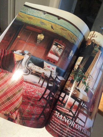
Think World of Interiors
These two pictures I took from
the May 2017 issue of World of Interiors.
The one above is a Moroccan farmhouse and below is an Edwardian home.
Or it was the other end of the financial scale and
it might have been in a home where
one doesn't necessarily inherit but
where one is a custodian so nothing really belongs to you.
One had to accept your great grandmother's cushions that were made out of her bridesmaids dresses
or the velvet curtains were from your grandfathers home in India
so nothing could be removed as everything had literally monumental value.
Think Chatsworth
But like a stew,
be it of vegetable scraps or of the finest cuts of meat,
time tends to mellow out the differences and they tend to fuse.
But then I do believe in the power of fermentation and maturation of things over time.
 |
This is a picture from Pinterest from a Swedish blogger from
the earlier days of blogging from 2009 ( thereabouts) but she has since quit blogging to go professional.
I can't find the name of the blogger as this picture was stored in my iCloud.
This picture spawned many a copy cat - at the time - this picture was a hit and I still like it. |
I find many intent clashes of material fail,
partly for the same reasons
why shabby chic tends to fail.
Because it is forced.
It is like abstract art,
I can not articulate
what the formula to a successful arrangement is.
If I could,
decor would be maths and not a creative domain.
 |
This is the bedroom of Ben Pentreath via
This is a modern and fresh interpretation of mixing prints a l'anglais. |
And before you go, here she goes again.
I think like most things,
there is a balance.
Or it is very personal.
If you like how it is in your home then there is no reason to change it but these things tend to filter down from pros to civilians.
But it seems like no one is stating what is evident publicly.
A bit like the decor version of the emperor's new clothes.
When I saw Nick Olsen's room in the annual design event the is the Kips Bay shophouse,
I thought it was time to post.
I am not picking on him perse
but using his room to illustrate what
I feel very deflated about decor done for PR
that gets infiltrated into the suburbs.
He is not a civilian but a person of note in his field
so I think even if he were to read this,
he really wouldn't be bothered.
He has influence and I do like his portfolio
and his success is much deserved.
He has worked under some design heavy hitters such as Miles Redd and one can see that influence.
Some of the people who go see his room
and get inspired by it will have the means to get a designer to recreate the mood of the room in their own home.
But many will attempt this on their own.
In what appears to be a clash,
there is a thread that is actually from the matchy matchy school.
It is easy to say -
I like it, hate it, don't mind it -
but I wanted to articulate in concrete terms
why I feel the way I do.
The best I can come up with is this.
There is a terracotta/ochre color in the folding screen in the left
that ties into the colorblocking in the large painting in the centre that matches the paint details in the curtain pelmet on the right.
The accent color is also in the sofa and the accent in the rug.
In fact, I think the pelmet ruins the room as a whole.
But that is another talk show.
I have tried putting my finger over the pelmet to block it from view
and the rest of the room is rather nice albeit cramped.
Usually there is no proper tie,
the cohesive thread is not as obvious as this.
A successful outcome is rather like a built up gallery wall of art by one owner.
It may seem disparate but there is a fundamental core base on which the person bought each artwork even if one is a watercolour or an oil with different subject matters.
For me, this room looked forced and
I think that is why it doesn't resonate with me.
I think this room is a great space minus 20%.
This study section of the room is one I would be more than happy with.
The walls are fabulous and the furniture placement is one of a professional touch.
In the article in the Washington Post,
it says that he was going for 1930's American expat in Paris.
I suppose it does evoke something of that era.
But then I must remember decorators like most professions nowadays must scream for attention and grab headlines.
This seems like the design soundbite equivalent of a politician who is up for election.
So I need to remind myself
to see these spaces with that in mind
and try to distill the essence of the room rather
than taking things so literally.
But as always, the main rule of thumb is do what you like!

.JPG)


