
I have had various drafts on this subject for years now,
especially with the revived and reinterpreted trend
of having various styles of textiles
in the form of scatter cushions,
in the form of scatter cushions,
bed spreads, upholstery in the home.
The clashing also applies to disparate art and furniture of course.
This "trend" always existed of course,
but in the form of haphazard placement with no intent of clashing.
but in the form of haphazard placement with no intent of clashing.
This was out of either economic duress where one couldn't afford new textiles so one made do with existing items.
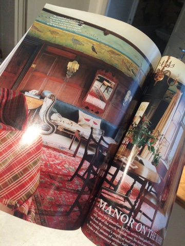
Think World of Interiors

These two pictures I took from
the May 2017 issue of World of Interiors.
The one above is a Moroccan farmhouse and below is an Edwardian home.
Or it was the other end of the financial scale and
it might have been in a home where
one doesn't necessarily inherit but
where one is a custodian so nothing really belongs to you.
where one is a custodian so nothing really belongs to you.
One had to accept your great grandmother's cushions that were made out of her bridesmaids dresses
or the velvet curtains were from your grandfathers home in India
so nothing could be removed as everything had literally monumental value.
or the velvet curtains were from your grandfathers home in India
so nothing could be removed as everything had literally monumental value.
Think Chatsworth
 |
| Via |
But like a stew,
be it of vegetable scraps or of the finest cuts of meat,
time tends to mellow out the differences and they tend to fuse.
But then I do believe in the power of fermentation and maturation of things over time.
 |
| This is a picture from Pinterest from a Swedish blogger from the earlier days of blogging from 2009 ( thereabouts) but she has since quit blogging to go professional. I can't find the name of the blogger as this picture was stored in my iCloud. This picture spawned many a copy cat - at the time - this picture was a hit and I still like it. |
I find many intent clashes of material fail,
partly for the same reasons
why shabby chic tends to fail.
Because it is forced.
partly for the same reasons
why shabby chic tends to fail.
Because it is forced.
It is like abstract art,
I can not articulate
what the formula to a successful arrangement is.
If I could,
decor would be maths and not a creative domain.
I can not articulate
what the formula to a successful arrangement is.
If I could,
decor would be maths and not a creative domain.
 |
| This is the bedroom of Ben Pentreath via This is a modern and fresh interpretation of mixing prints a l'anglais. |
And before you go, here she goes again.
I think like most things,
there is a balance.
Or it is very personal.
If you like how it is in your home then there is no reason to change it but these things tend to filter down from pros to civilians.
there is a balance.
Or it is very personal.
If you like how it is in your home then there is no reason to change it but these things tend to filter down from pros to civilians.
But it seems like no one is stating what is evident publicly.
A bit like the decor version of the emperor's new clothes.
A bit like the decor version of the emperor's new clothes.
 |
| Via Nick Olsen instagram |
When I saw Nick Olsen's room in the annual design event the is the Kips Bay shophouse,
I thought it was time to post.
I am not picking on him perse
but using his room to illustrate what
I feel very deflated about decor done for PR
that gets infiltrated into the suburbs.
I thought it was time to post.
I am not picking on him perse
but using his room to illustrate what
I feel very deflated about decor done for PR
that gets infiltrated into the suburbs.
He is not a civilian but a person of note in his field
so I think even if he were to read this,
he really wouldn't be bothered.
so I think even if he were to read this,
he really wouldn't be bothered.
He has influence and I do like his portfolio
and his success is much deserved.
and his success is much deserved.
He has worked under some design heavy hitters such as Miles Redd and one can see that influence.

Some of the people who go see his room
and get inspired by it will have the means to get a designer to recreate the mood of the room in their own home.
and get inspired by it will have the means to get a designer to recreate the mood of the room in their own home.
But many will attempt this on their own.
In what appears to be a clash,
there is a thread that is actually from the matchy matchy school.
there is a thread that is actually from the matchy matchy school.
 |
| Via |
It is easy to say -
I like it, hate it, don't mind it -
but I wanted to articulate in concrete terms
why I feel the way I do.
I like it, hate it, don't mind it -
but I wanted to articulate in concrete terms
why I feel the way I do.
The best I can come up with is this.
There is a terracotta/ochre color in the folding screen in the left
that ties into the colorblocking in the large painting in the centre that matches the paint details in the curtain pelmet on the right.
The accent color is also in the sofa and the accent in the rug.

In fact, I think the pelmet ruins the room as a whole.
that ties into the colorblocking in the large painting in the centre that matches the paint details in the curtain pelmet on the right.
The accent color is also in the sofa and the accent in the rug.
In fact, I think the pelmet ruins the room as a whole.
But that is another talk show.

I have tried putting my finger over the pelmet to block it from view
and the rest of the room is rather nice albeit cramped.

Usually there is no proper tie,
the cohesive thread is not as obvious as this.
A successful outcome is rather like a built up gallery wall of art by one owner.
It may seem disparate but there is a fundamental core base on which the person bought each artwork even if one is a watercolour or an oil with different subject matters.
the cohesive thread is not as obvious as this.
A successful outcome is rather like a built up gallery wall of art by one owner.
It may seem disparate but there is a fundamental core base on which the person bought each artwork even if one is a watercolour or an oil with different subject matters.
For me, this room looked forced and
I think that is why it doesn't resonate with me.
I think that is why it doesn't resonate with me.
 |
| Via |
I think this room is a great space minus 20%.
This study section of the room is one I would be more than happy with.
The walls are fabulous and the furniture placement is one of a professional touch.
In the article in the Washington Post,
it says that he was going for 1930's American expat in Paris.
I suppose it does evoke something of that era.
I suppose it does evoke something of that era.

But then I must remember decorators like most professions nowadays must scream for attention and grab headlines.
This seems like the design soundbite equivalent of a politician who is up for election.
So I need to remind myself
to see these spaces with that in mind
and try to distill the essence of the room rather
than taking things so literally.
But as always, the main rule of thumb is do what you like!
to see these spaces with that in mind
and try to distill the essence of the room rather
than taking things so literally.
But as always, the main rule of thumb is do what you like!
This room looks like several relatives died and this person inherited all their things. And couldn't afford to recover anything. It is a total mess, in my not very humble opinion!
ReplyDeleteI think this guy is talented; but I detest this room. Forced, and terrible. It gives me a headache!
You are being kind as I feel this is a room with a few affectations. Seems like a Francophile American who just inherited - but not a huge fortune but he certainly was the richest kid in town who moved to Paris for a few years. He is talented but this room almost had it but missed the mark.
DeleteYou are the sweetest to say I was being kind!
DeleteA lot to say on this topic. I feel that a lot of interiors at the moment is screaming about the clever designer, and there isn't the actual personality of the client in the room much. The whole pattern/ period/ colour mixing thing is I think a designer reaction to the blogger decorators, as really they don't have the added 'it' to pull off the look. A bit like in fashion too, where what is done on the catwalk doesn't sometimes work when it gets to H&M.
ReplyDeleteBut I am really pretty over everyone pattern clashing in a bad way and thinking they're clever for doing it. Fine if you just want to use what you like, and that's your colourful personality - usually it works. But for the person who is adopting the look it comes off as very forced. And doesn't work out well - there will be no World of Interiors shoots at the end. And just as you said a bit like all the bad gallery walls out there, done by amateurs and professionals alike......because I have seen some very bad gallery walls full of abject disasters of 'art' done by supposed professionals who want to make it look 'collected' when their client didn't collect a damn thing.
The Nick Olsen room doesn't work for me because of the Chintz chair. All the other things have a geometry or colour running through them that ties in. But not the Chintz. I used to work for a woman in London who was very good at throwing in one odd thing that would bring a scheme to life. You'd look at it on the sample board and thing what on earth was she thinking. But it always worked. Not here though...I don't like the pelmets either :)
I agree completely! The chintz chair looks like it was dropped by a helicopter. Seriously. If it had belonged to an individual who collected.....then.....maybe. But it so obviously doesn't, Thrown together is not a look that works. I would have a nervous breakdown if I had to spend any time in that room! Talent gone haywire! I am going from California to NYC to see this Showcase house.....I will report from the front! thank you for the great post!!!
DeleteAn American expat in Paris in the 1930's who was having a nervous breakdown.
DeleteI forgot to say......now twice! That wallpaper is the most nightmarish thing in the whole room! EWWWWW!!!! Yuck. I cannot believe how much I hate this room. And I will see it week after this. I will report. Mark Sikes says he likes it. Yikes.
DeleteThe chair was the oblique object though I see he did try to mirror the floral bouquet on the coffee table with it. He was ultimately matchy which was surprising when you broke it down. The "pop of color" was great in Miami in the 80's 90's when their hotels really brought it to the main stream but those pelmets should have been a different color - perhaps it would have worked better. Art walls are a funny thing aren't they? It has to be done with the intrinsic yet intangible quality of real love and art enjoyment otherwise if it is done over a weekend for some reason most can tell oddly no? But then yes - this was the headline room and not the real life room as you say Heidi
DeleteDropped in by helicopter lol! I think 30's was ripe for breakdowns hence Freud an Jung's fertile ground. I like the walls by Maya Romanoff! I really do but then again I am a Jean Michel Frank groupie. I think the room and the wall just didn't get along at all. If you see it in the original way from the 30's, it seems to give enough visual interest to otherwise simple rooms. But I always say differences make decor and design so much fun!
DeleteI agree with Penelope that the wallpaper is truly a nightmare, what a backdrop for all of the other hideous elements in the room! My gosh my eyes are burning. I don't care for any of the elements separately never mind together. I guess I like the bar tray? Not sure I'd enjoy that room even with a cocktail or two though.
DeleteThanks for sharing this Naomi with your interpretation, if I had just happened across this otherwise I would feel very confused and discouraged. XX
It really doesn't do anything here and nothing really stands out but then again it all sort of sticks out! I love JMFrank and one of my dream furniture pieces is his marquetry side tables that look just like these walls :) PS I think you like the drinks on the bar tray! LOL xx
DeleteWhy do people continue to take those pictures of a man (it is always a man) lying down supposedly napping in an expensively decorated room? I realize that it is supposed to connote privileged ease amid luxury, but the man always looks dead, even with his prop of newspaper or book, and I get the feeling that I am crashing the wake.
ReplyDelete--Jim
I don't see that. I will go back again.......for the third time! I love you and your taste!
DeleteIt is the height of laissez-faire darling! He fell asleep reading the racing post in the picture too :) not the most exciting headlines but then i suppose he wanted to have something to talk about with the queen later on in the day??? :)
DeleteAnother intriguing and thought provoking post, Naomi!
DeleteI suspect the man was Debo's husband, the last Duke, having a snooze in his library at Chatsworth. He was also known to be a bit of a dipso (and so a great worry to his wife), so maybe that had something to do with it. I adore this room, full of history and all the couple's (here probably mainly his) quirks and interests.
Also agree about the Nick Olsen room. The pelmets are truly hideous in this busy room - kind of like a Rorschach ink blot, perhaps referencing the 30s psychiatrists? I am a maximalist at heart but this room would send me round the twist. It has no calm or serenity or ambience - and is, as you say, forced. Rooms with grandmama's bridesmaids' dresses converted to cushions - or whatever of this ilk - usually tend to have personality and a feeling of history and family life - not just odd things grouped together by a decorator.
You and Heidi have worried me about our gallery walls! We have them all over our little house because we have too many paintings and photos. One in the study is a wall of family photos (our own, eg G's grandfather when a boy in his kilt, not things picked up in a market), including some from probably the turn of the 19/20th century, Another is a wall with my husband's own paintings from when he was a teenager, another in the dining room a wall of paintings of women - I started this because G hung a large sketch of a naked lady he did in a life class. My mother objected to having to look at this lady over dinner - so to take the edge off we continued to hang more pictures of women, including a small pencil sketch of me when very young. Now the naked lady (it got rather annoying when some guests kept asking if it was me - clearly she's nothing like me - but they couldn't believe I'd allow my hubby to go around drawing other ladies naked) no longer stands out. There is also another wall (just a section next to a door) which has a gallery of icons - some old but mostly new, museum quality copies of Russian and Greek icons - and a small Cuzco school oil of an angel. Pammie xx
yes perhaps the pelmet was a nod to those ink blots Pammie! Oh I do love gallery walls! I adore them - for the most part. I just don't like the forced recreation of them is all. But I have found that if someone loves something and puts it up it somehow works. It is a visceral thing. It tends to fall flat is you put it up with a - I am so clever vibe! I am itching for something Cuzco - I love that style! xx
DeleteI found the Cuzco angel in a little antique shop in the bastide village of Monpazier in the Dordogne years ago. It was in the window but the shop was always closed - no matter the day or the time. Finally I asked one of the shopkeepers close by - they said an old lady owned the shop and she only opened when she felt like it. They were so kind - put me in touch with her nephew who sold it to me. Have always loved that picture of the angel - fishing, with a river and hills in the background. Strange, but so beautiful and serene. So interesting that you love the Cuzco school too! They also had the most wonderful Madonna that I died for - but it was huge - and beautifully framed and I'd never have managed to get it home safely. Without freighting at a BIGLY (isn't that an amazing word!) cost probably. Pammie xx
DeleteIt is hard to get the small ones and they do tend to be huge and the smaller ones used for devotion tend to be much more dear than the bigger so it has still escaped me - for a good price that is :)
DeleteCan't remember what I paid - it was years ago. Not really cheap - but still quite affordable. Think I was lucky, the shop was hardly ever open - the old lady sounded quite eccentric. I didn't bargain. The nephew said up-front he couldn't accept any price other than the one his aunt had put on it. And I had to have it - had been admiring it every day - we were staying in the countryside just outside lovely Monpazier, it was our local village. The picture fitted easily into a suitcase. An unusual find in rural France. Good luck with the search! Pammie
DeleteThanks Pammie!
DeleteI found him! It was indeed the Duke of Devonshire......(she maybe hoped he was dead......he was just passed out), Sad story. She was my complete idol. COMPLETE. In every way.
DeleteWhat a brilliant room. The perfect example of "collected". T
he Real deal.
I exceeded my quota! Your comment is the best!
DeletePenelope
DeleteAs you're a Debo/Mitford fan you may already have read the volume of letters between Debo and her great friend (some suspected at one stage perhaps, lover, but only ever speculation) Patrick Leigh Fermor, "In Tearing Haste". She writes at times of her marriage and her worries about her husband and alcohol (he was also notoriously unfaithful)- who was also a friend of Paddy's. They're fascinating letters - she writes in her own inimitable style, often hilariously, of her life, friends, family, travels, the Royal Family etc (she always referred to the Queen Mother, who was very fond of her, as "Cake"). There are also Paddy's letters to her. He was a great communicator too and his own autobiographical books, starting with his walk across Europe as a young boy - a kind of "gap year" initially - in the years leading up to WWII are fascinating. He also wrote in a sequel of his time as a British soldier working with the partisans in Crete and their kidnapping of a leading German General. A film was later made of this. If you haven't read, wonderful stories, memories and impressions shared between two great friends. Such fun and so worth reading if you're a fellow Mitford tragic. Best wishes, Pammie
I like the idea of decorating by passion and sentimentality. It seems to reflect values--"I love this because it was my grandmother's" or "I love this because it got it on an exotic vacation." Not going through catalogs to calculate eccentricity or to fake worldliness.
ReplyDeleteMe too - despite artistic preference - I think being genuine is key.
DeleteNick Olsen's references to JM Frank, YSL/PB, Berard etc indicate erudition, but the end result of that inspiration is utterly misguided, a hotchpotch of design quotations adding up to chaos and confusion. There is nothing wrong with being playful; and clearly this room is a gesture of defiance against the ubiquitous all white "modernist" rooms so beloved of Manhattanites. Still--it falls short of its intentions. This isn't to dismiss Mr Olsen entirely--his work for clients is commendably intelligent--but when a chintz covered chair is inserted with a sort of deliberate irony, the thinking is all over the place.
ReplyDeleteHello Toby, indeed as you aptly put, there are many design quotations. There is a fine line between consideration and overthinking which is rarely successful in any bits of life. I think Mr Olsen might have done things differently for his client back in the 30's!
DeleteYou know you are my expert in all things to do with modern interior design since I don't have the gene. I am not feeling Nick's room at all. Is that in Kips Bay, as in Manhattan? So not feeling this. I am glad you pointed out how it is matching, and I see it now, but it feels so cluttered to me. I think I really like cream and pale (and I mean pale) pink with a chandelier thrown in somewhere and pale gold trim and peonies and books everywhere. I want to live in a room like that lol. So I don't think Nick would take me as a client when I finally get my dream pad on the UES because I want all of those colors/items mentioned above and I want it to be simple!
ReplyDeleteLove your interiors posts. I always do. xx PS Where is GSL keeping himself these days. It's time for a political post.
But you do have the fashion gene! Yes it is in the upper east side. There is maximalist and then there is cluttered. I feel this is cluttered too. I think GSL is plotting a run for mayor of Chicago perhaps? xx
DeleteTo my eye, all the NYC show-houses have a common flaw: too much stuff and too many ideas crammed into too little space. Yes. space is at a premium in many dwellings here, but just because a room can hold 3 couches, 5 patterns and random plant matter doesn't mean it should. A designer asked me what I thought should be the focal point of our living room, and I said "Me." She thought I was wasting her expensive time trying to be funny, but i meant it. Why should I be surrounded by unbecoming colors, backless things to perch on, no place to leave a book, and hazardous electric cords leading to dim lamps?
ReplyDeleteSo funny bc when we moved where i live now my husband wanted a bed in each "bedroom" and we had such a row about this too! I adore what you said WFF - it is and should always be about You! Eureka. That is why this room fails bc it is for people passing through and for likes on IG. backless chairs are the friggin worst too ;)))) benches are everywhere nowadays...
DeleteSo agree about backless chairs and benches - also stools. They're popping up everywhere, including trendy restaurants. Who wants to perch on a hard wooden stool or backless bench?! As much as anything else, homes should be about comfort. Pammie
ReplyDeleteThey are posture trainers! :)
DeleteNaomi
DeleteTrue! I seem to remember you have good posture already. Think I had once too - but nowadays I like my comforts. Also good ergonomic chairs are great. Not many of them around. Pammie
I agree with both of you!!!
ReplyDeleteI really love this post ! I hate elements in that room like those pelmets and the chintz arm chair. I like to pattern clash because it's how I dress and my home looks like me. I always think people dress like their interiors. I'm all about the deeply personal and slightly shabby. I didn't decorate this house overnight, it's taken years to build up the art collection, source the antiques, and collect the furniture. It's like a garden- you just cannot get it done over night, it needs to develop. I like to mix stuff my parents bought in the 60s with other old stuff and some new stuff. Forced interiors just look forced. Keep up the good work xxxx
ReplyDeleteYou do demonstrate what i mean by if it is genuine and you love it. I don't know if Nick Olsen was loving this. He seemed to be like - ok - what will look great on IG? what vignettes can I do that is photogenic instead of going for a feel. I guess when you have an imaginary client that it is easy not to have borders. Yes it does take years I agree very much like a garden. xxx
DeleteI guess I missed this post! Love that you shared this. I am in complete agreement Naomi, this room is too contrived, and not organic as something like Chatsworth is or was. This room gives me a headache and is trying way too hard. Let's be frank, it's downright ugly. It's like you went to a yard sale, took it all home and put it in one room. Just because he's hot right now, doesn't make it cool, but that's how it is in the design world. A lot of others have an ugly aesthetic too. Love the Emperor's New Clothes analogy -so fitting. xx Kim
ReplyDeleteI think it would be nice to see him do a room for a client who won't let the room be public and see how he does. I think the PR factor oddly ruined it too xx
DeleteI agree with FF, collected over time is the only way this look works, with things that are personal, family hand-me-downs, etc. Yes keep being our decor warrior Naomi!! We need someone not drinking the kool-aid!
ReplyDeleteLove.
ReplyDeleteGreat post and blog. Came by from Faux Fuschia. Personally, I think this room is dreadful, but what do I know?!? Cathy
ReplyDeleteI think like or not like is different from knowledge anyway Cathy! you are right ok? ;)
DeleteWonderful colour-infused post. I love a clash of design but agree that pelmet has to go! xo
ReplyDeleteThe pelmet looked a bit university theatre! x
DeleteAs you say, decor is very personal. Rarely does a decor resonate for me. That said, I love the Churchill estate and decor. The scale and furniture placement, in every way, was to perfection (for me). The colors in the round dining room with the round table were salmon and light green. lovely. Oriental rug and drapery were beautiful. In so many decors either the colors, prints, and/or scale are off. Not at the Churchill estate. I wonder who did the decorating at this estate? Susan
ReplyDeleteYes decor is very personal and even then logic is very hard to weave into what one enjoys and doesn't. Like food I suppose? At the Churchill estate, I think there are parts where one of the family members who is a famous interior designer herself did some of the public areas.I think her name is Henrietta Spencer Churcill of the firm of her namesake.
Delete