
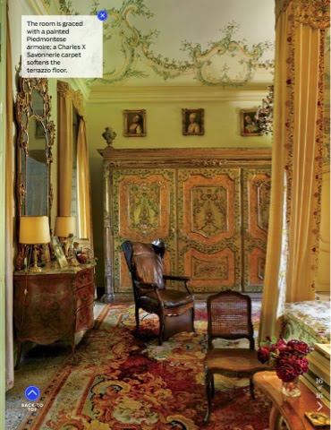
As the September issue is usually synonymous with fashion,
the theme for the AD September issue was the homes of fashion designers.
the theme for the AD September issue was the homes of fashion designers.

The first home was the Long Island home of the Calvin Klein designer Francisco Costa.
His home was streamlined and minimal as you would expect from a designer of that brand.


I only included these three because streamlined design is pretty similar visually and there wasn't much to take away from white walls and furniture.

Aren't you curious to see what Natalie Massenet's house looks like?
She is the founder of Net a Porter and
sold her stake for a sizable sum.
She is the founder of Net a Porter and
sold her stake for a sizable sum.

This is the home she bought with the windfall.

A staircase and an outdoor courtyard like this is normally seen in hotels or government buildings in London.


I am looking at the space and the features.

The sofa is in the legendary L'arbre de Matisse which is very popular for upholstery.
I wrote about the fabric in this post last year.
This is her dressing area and the inner sanctum of most homes.

in the master bedroom but then again
I am sure it is for security reasons.

While I do love the Zuber wallpaper, I love the bed even more.
It is a great London house with tasteful decor and
I appreciate she didn't go over the top.

Most of you know that I am now a solid fan of Martyn Lawrence Bullard after I met him at Design Week in the spring.
However, I am not a huge fan of Tommy Hilfiger and his designs.
However, I am not a huge fan of Tommy Hilfiger and his designs.

I am not a fan of primary colors unless used with finesse and the correct dosage.
Hence I am not a fan of this room.

This media room which is always a token necessity in American mansions is atrocious. Even if you were watching a Disney cartoon you would feel like you were watching porn.

This bedroom looks like it is Captain James T Kirk's playboy pad on the Starship Enterprise.

This bedroom looks like it was decorated by some broke ass hippies still high on LSD in the 1960's.

The aforementioned hippie's lovechild's bedroom and bathroom...

This black and white striped and chevron bathroom is the room where you would go to if you needed a visual break and rest.

This room just looks like a lobby of a hotel in Miami
that used to be trendy in 1982 and still gets guests
who gives the hotel really bad reviews on TripAdvisor.

I love Isaac Mizrahi. I was so sad when he went out of business.
The design business is brutal because talent doesn't equate to corporate acumen and expertise.

His good taste carries through to his home.

Nice art, good furniture, varied tones with a touch of modern and avant-garde touches.

Not spacious enough for most smaller cities but enough room for a little table and a great view.

This next house was so funny that I laughed out loud.
I don't think that was the desired effect however.

Also, calling itself moody coupled with excessive photoshopping was only going to create a pastiche of an editorial.

This is his master bathroom that is tiled in Bisazza tiles.
As I can't see a bloody thing in that picture of black and white with filtered light I will just have to take their word for it.
That painting of a guy with a cut throat could be a self portrait of what happened when he tried to shave in that dark bathroom.

He hasn't chosen the best appetizing art for a dining room.
Murder scene or are we still waiting for everyone to join us for breakfast?
Murder scene or are we still waiting for everyone to join us for breakfast?

I have a funny feeling that the dog was chosen to suit his home decor.

I like Adam Lippes.
He designed a chic leopard print outfit last year that I had my eye on but never went through with.
He designed a chic leopard print outfit last year that I had my eye on but never went through with.


Mind you most of it is the period features that does most of the work.

Just as I was thinking how I could move in, I saw this.

But this is an anathema even to an Oprah fan like myself.
The whole taste level just bombed and negated the rest of the house with this whim. I love irony and I love a sense of humor but for some reason I can't forgive this one.

It is a classic home decorated with tasteful antiques and heirlooms.


I am including Carlos Souza's Brazilian home as he is a renown "tastemaker". He is the brand ambassador for Valentino.


Isn't the scenery the clincher though?
I could take a hut with this view.

There are more images that I will be pinning to my Pinterest for those who would like a more exhaustive look through this issue.
The Tommy Hilfiger house is as bad as I've ever seen; btw I detected neither finesse nor correct dosage but I'm sure this will be something else he'll sell to some hip-hop mogul.
ReplyDeleteThe Pret a Porter woman's home was lovely and I also like folding screens.
Well done Naomi!
Naomi, that Budapest apartment of Robert Adams the Hattatts recently featured is about the best I've ever seen. I love it even more every time I go back and look at it. Has he been in any recent ADs?
DeleteYes Mr Hilfiger does seem to sell on his fashions and decorated homes to hip hop moguls. I must look into that flat because I adored every feature about it and it incorporated all the design elements I adore so will look into it GSL!
DeleteDarlings G and Naomi,
DeleteRichard's apartment has just been featured in two Hungarian publications with pictures far more professional than ours. His previous flat in London was featured in World of Interiors. We hope one day to invite you both personally to see for yourselves......we do think that it is lovely!
Thank you for such an interesting review of AD.
ReplyDeleteAgree about Tommy Hilfiger's house. How could anyone sleep in those bedrooms! The yellow would induce bilious vertigo and the red a migraine. The only thing I kind of liked was the banana wall paper for a children's bathroom, could imagine it linked with themed tropicals - palms and monkeys etc, but only kind of. And certainly not with scent. Too horrible. Also the scent might contain some seriously bad chemicals that they would inhale for years. The media room is a nightmare. Like a womb about to shed. What was Martyn thinking!
Sadly not a lot I liked in this issue - and your captions are so spot on. The only ones really were some rooms in Nathalie Massenet's house: the kitchen, the room with l'arbre de Matisse sofa, the secret closet in the master bedroom and of course the fabulous courtyard, which reminds me a bit of the Ralph Lauren courtyard in Paris where they've set up the restaurant. Didn't think the huge canopied bed quite worked in the main bedroom. Too over scale for the room. Get that they might have been trying for a tent effect against the beautiful wallpaper and tree, but perhaps a bit too monolithic and out of scale. Also the blue on blue picture on the staircase - not so impressive. Someone should show her some good artworks by Australian aborigines, particularly by the women artists.
Also liked one or two of the Agnelli rooms, specially the salon with the leopard chairs and the grand bedroom - and of course the Adam Lippes, not highly original, but on the whole serene and very comforting and liveable. Except the bedroom. Got that badly wrong, just silly really. The minimalist Calvin Klein designer home is terribly boring, except the library. The Breaking Away house is bizarre - worry about anyone who can either (1) design it or (2) live in it. Only a few clicks away from madness. Particularly the artworks.
Sorry to hear about Isaac Mizrahi going out of business.
Pammie xx
That TH house was just beyond comprehension. I know MBL can be a bit extreme but this was just not on point at all I am afraid. I can't get over the real estate that Natalie bought! That house is just so rare in its size! I agree that her walls would be properly adorned with a good selection of art that included some Aboriginal paintings. I find those paintings oddly work with any period and most homes. I regret not getting any before I left Australia - I had my eye on something but it was just beyond my budget so I let it go but I should have let go of some shoes instead...That breaking away house still cracks me up!! xx
Delete'Like a womb about to shed'...Ha!
DeleteOoh, give me Francisco Costa's house any day. I could look at that kind of serenity every day:).
ReplyDeleteVery serene and he has incorporated his Calvin Klein ethos in a home and I know I could get some work done there too!
DeleteAdam Lippes has some nice furniture but that brown bedspread ..awful.But I do love the Chinese artwork on the living room wall.
ReplyDeleteAs always many of these rooms only show yet again money has nothing to do with taste
Adam Lippes was doing so well until that Oprah sign...That adage about money vs taste seems to be a monthly reminder on AD don't you think?
DeleteThanks for the laugh!! That gloomy house with the atrocious art (who on earth wants someone with a cut throat on their walls?) reminds me of the hotel in Verona friends stayed at. It had Cindy Sherman photographs on the walls, her clown ones. They said it was positively spooky, and couldn't wait to get out of there (it was their honeymoon, so not exactly romantic to have creepy clown photos on the walls). If you're not familiar with her work, google to see what I mean!!
ReplyDeleteThe Tommy Hilfinger house is just horrendous. Absolutely atrocious. I don't see that anyone could actually live in it full time. I couldn't spend a night in there. What was MLB thinking? Loved the Agnelli house, although it wasn't exactly decorated - it's all fairly original I think? Natalie Massenets house is surprisingly normal though. For prime real estate, and someone in fashion, it's actually quite a change from what you'd expect - no trickery in it at all, and not high on the glamour factor as say, Tamara Mellon's house is.
I concur with everything you have said here Heidi.
DeleteNatalie looks like she has some nice Frette sheets on the bed and I like the grey comforter quilty thing. I wonder how many servants she has. Jealous.
I LUFF Mr Mizrahi too and I have a book here about 13 years old by Lisa Lovatt-Smith and his NY apartment features and his home was so cosy. The balcony garden was divine too. After seeing all the lilac I went and remade the bed in lilac shades. I can do that because I own about 11 doona covers and a million stunt cushions.
Yours in zebra pegasus scarf love, xx
@Heidi - glad you got a laugh! Margaret Russell would hate me though. But that cut throat is supposed to be symbolic or is it supposed to be a diet tip in the dining area??? Cindy Sherman is pure museum stuff and not meant for domestic settings at all IIMHO. The Agnelli house is just serene and has all the classic elements and isn't jarring at all isnt it? I mean who could not like it? But re Tamara Mellon's house - MBL did her home whereas I think with Natalie M's home it was mostly done by Michael S Smith and had lots of elements from different companies so didn't have that "signature look.
Delete@FF - I am sure she has got the London trinity of nanny, cleaner, and PA. I could use a PA.
I love your sign off!! I reckon we three can all be scarf twins soon because after H showed her zebra wings I am on the look out now too!!! xx
Naomi
DeleteHave come back and read all the new comments. So interesting and entertaining! So many different points of view - but mostly in synch with your assessments. Love your new review take on magazines. Agree about the Cindy Shermans. Recently stayed in a couple of hotels, eg in Berlin Swissotel, where there were lots in public rooms and hallways, highly decorative and quite attractive but if you stopped to look more closely, most had a humorous twist, some quite macabre, even slightly sinister (though none like Dexter's victim). Enjoyed them in these areas as they were more interesting than the usual bland offerings. But agree would not want to be closeted with them in a hotel room or apartment.
Also just a bit of special pleading about the shelving of books. It is really difficult to shelve the lovely huge coffee table books if you also have hundreds/thousands of normal books as well. Sometimes it's tempting to build little piles of them on each other, not too bad for the books, I hope, if there aren't too many in each pile. Admit to doing that on coffee tables. Some books are for devouring cover to cover and some we buy just to drool over the pictures. I do admit. Also, remember having seen a picture of a room in one of the Italian publisher Signora Feltrinelli's houses - she had huge teetering piles of books on her floors. Don't think she could be accused of not reading.
Once worked for a short time in the Cambridge University Library - their solution was to include a special size factor in the cataloguing and shelving of books, eg at the end of their classification number would be an A, B, C etc. The books were shelved within their classifications but also by size, large books together, middle sizes, small and even tiny sizings. In a huge library like that it was more efficient in fitting all the books in - but who can do this at home? The method I have serious problems with is the one where they shelve them with the spines at the back of the shelf! Just don't get it.
Cheers from the scarf quadruplet! Pammie xx
Scarf quadruplet! Sooo excited! Am going to get mine on Monday :)
DeleteBut re books - it is a hard thing because even though I have read mine I can't let go and so they are in corners of the house and my favorite are displayed in all sorts of ways...But when I moved it really was just boxes and boxes and I was thinking I must edit! Spread the word eh? xx
Yes also have trouble letting go of books I've enjoyed - and there are so many. But keep buying more so have to do it sometimes (also buy from fetes and Op. Shops). Either give them away to friends or to our local Op. Shop where I volunteer. Husband has a project of reading at least one work by every Nobel prize winner for literature - so you can imagine his collection alone (and he gets to keep all his). He's done it too, but now he buys more books by the authors he specially likes and then of course has to keep up with each new one as they're announced. Think they love us at our fave Canberra bookstore, Paperchain, we certainly spend enough money there. Pammie xx
DeleteI put a ban on book buying though I have sneaked in about 15 more since then. Imagine what it would be like without a ban...But I have piles to give away and do a jumble sale because I must edit. Your library must be huge!!! I hope your bookstore gives you loyalty points Pammie! xx
DeleteGreat review! So true about that media room. It looks like most of those designers taste is in their mouths! Horrid. The murder scene artwork is disgusting and Hilfiger house is simply awful. I knew there was a reason I stopped buying that magazine. Thanks for giving us the heads up.
ReplyDeleteWhy does it always have to be a media room? Why not a wine room? Could you imagine if you went for a weekend to the black and white house??? You would be making excuses to leave real quick no? ;P
DeleteNot fond of the Hilfiger house. Perhaps Martin was going to be fixing it??? Indeed what would Oprah say? Probably hire Nate Birkus to redecorate. x
ReplyDeleteWhat would Oprah say - that picture might now become the emblem for bad decor decisions!!
DeleteCouldn't agree more on Tommy's Hilfiger house. Just too kitch!!!! the taste of a parvenue, dare I say it? After those pics I am more than sure I am never going to buy any Calvin Klein wear.
ReplyDeletethank you for the super funny review, the best way to start a working day!!!
I think MBL was just let loose and he got to do what he would never do in his own home and just got to experiment while getting paid for it! Lucky for some eh??
DeleteI will take the Brazilian kitchen (look at those amazing chairs!) and the superb views.
ReplyDeleteI think I would cook everyday in a kitchen like that!
DeleteThe Tommy house is ghastly. Ditto for the Oprah art in an otherwise pretty space. Tatler has a great piece on how bringing social spaces into one's home is antisocial. I tend to agree and the media room falls squarely into this category. Go out to the movies or be content with your little telly I think. Great review!
ReplyDeleteGhastly!!! I must read that article. I haven't read Tatler in a while - I usually read at the hairdressers. Yes the movie theatre or the ipad for viewing things but a media room just seems so forced...
DeleteThat's it, I'm off to say buongiòrno to the Agnelli's.
ReplyDeleteI won't be stopping at the Hilfiger's on the way...no socks, dreadful decor, and a media room. Très plouc!
Books piled up flat on shelves is the visual equivalent of nails down a blackboard.
And the books don't appreciate it either.
It's a sure sight that the person doesn't read, and only uses them for decor. Très plouc!
Natalie Massenet has a great location, but there's nothing worse than something looking 'done'. Stuff just purchased, rather than collected with passion over the years, has a habit of looking like the inside of a shop or hotel. Much like a face lift, blue teeth, breast implants or a trout pout everyone can see you've thrown money at it, but money and taste seldom go hand in hand.
With all that net money I would have expected a better courtyard. Gravel? Vraiment Nat?!
What would Oprah say?
I say PLOUC!
(*Plouc - personne qui manque de savoir-vivre.)
I would be lying if I didn't question what on earth MBL was thinking... She does have a great location but I think she has gravel bc that courtyard is on basement level. Let's face it - not a sun trap especially in South Ken and I noticed those courtyards end up mossy so that is probably why they did gravel just because of the maintenance versus usage of it. Plus a lot the drains go into courtyards so it tends to be dampy too. But if budget were no concern I think I would have done something bc I wouldn't be the one mucking it all out anyway hehe Love "Plouc"
DeleteI am not a fan of TH and now I'm really not a fan, that house is truly ghastly. As is the murder scene house but I did have a good laugh over your comments around the dark bathroom!
ReplyDeleteToo bad about the Adam Lippes apartment, and it was going so well... thanks Naomi I truly enjoy reading a dec magazine with you! xox
What the heck were the photoshop team thinking? COuld you imagine if you dated that guy and it was the first weekend away at his house!! psycho killer...But I think you would love Adam Lippes clothes as it is quite you Dani! xx
DeleteNaomi
ReplyDeleteThe Agnelli lifestyle is as impeccable as the Hilfinger one is awful. Despite what one may think of the Hilfinger brand, you would think someone who made it to the level he enjoys could do better than what AD just highlighted. I declare, Good Lord that really is just not good stuff! Of course, all the spreads in Digest got me to thinking about a problem its editors must face every issue and that is how properly to display the interior goodies without making the whole look phony and staged. After all, people are supposed to live, breath, sweat, sleep, love, and laugh, eat, and exist in these homes…
Yes two polar opposites indeed. AD sometimes does go against taste level for PR behind the scenes politics but to their detriment. Being friends IRL doesn't help being honest - I mean we have all been there haven't we but if I were paid to be an editor for such a publication I would not have included that house. And yes you are right - a home can't be a stage set but a platform for real life.
DeleteAnd that gets to the problem doesn't it? For instance, the Hamptons guy, I refuse to believe that man ever has had one meal in his dining room, let along spent a night in that dreary, dark, overly thought, overly pretentious (can that be), beach house…
DeleteI think he hosts parties and does photo shoots and goes to a hotel!! ;)
DeleteTommy hilfiger's place looks like somebody ate Pantone sample cards and vomited them on the decor (that was the cleverest thing I could think up)
ReplyDeleteWhen u gonna unveil your masterpiece ?
Pantone vomit exactly Cilla!
DeleteMy masterpiece?? Do as I say and not as I do hehe
But seriously - it ain't even done yet and still have unexplained leaks and need to seal and unpack boxes...le grand sigh. But will post something eventually even if undone I think :)
Hello Naomi,
ReplyDeleteWe do love to peruse a magazine with you. It is like having a jolly companion by one's side with whom one can stare, shout and roar with laughter out loud as page after page is turned.
We have to say that we are seriously underwhelmed by most of this. We do wonder if these houses, the Agnelli's is an exception, are really lived in since it would surely be far more attractive and comfortable to live in a good hotel. The choice of works ( we hesitate to use the word Art ) to cover the walls is a particular worry. There are so many wonderfully talented contemporary artists that we cannot believe the choices which have been made. Or, why not splash out on a grand old master rather than banana wallpaper. Has the world gone mad?
We were beginning to think that at least the Agnellis could be relied upon.....until we caught sight of the words......television room......oh dear. Plouc! Or NOCD..... Not Our Class Darling!
Cazzo!...the Agnelli's have a television room!
DeleteThat's it. They're off my Christmas card list.
Trop plouc pour moi!
Oh dear - that detail passed me by! Alas all moguls of all sorts have media rooms...You have the eye for detail but this has made me laugh :)))
DeleteWow. So that's how the other half lives?! Never been a Tommy fan. Is he color blind, bless his heart, or a six year old man child? And then there is Dexter's home. Don't think I could be friends with him....
ReplyDeleteMe neither - not my sort really!
DeleteOh my goodness, that mirrored powder room/bathroom. I feel like calling an interior designer right now! The problem with these magazines is that they make you reflect on your own home and realise it needs a good ole makeover. So interesting to have a tour of the Net a Porter entrepreneur - not sure what I imagined and not exactly my taste but I love it nonetheless. I don't mind writing on the walls, quotes can be quite nice but I don't like the idea of featuring another person's name, especially in the bedroom! xx
ReplyDeleteYes it is a mood killer isn't it?! I feel like calling a designer as well but I do like the not too try hard look from one designer either. But i think a makeover is alike a haircut - the mood just grabs you no? xx
DeleteI love your magazine reviews, and I love the discussion that follows, and here everyone's outdone themselves.
ReplyDeleteA friend's country place was in AD, they had a little old farmhouse upstate and added an attached barn. The barn was shipped in pieces from another state and reassembled and refinished on-site. They have a lifetime subscription to AD and a collection of back issues, all of which live in a long low bookshelf that doubles as a long low breakfast bar. This is why I don't read AD but wait for reviews instead. Like yours.
xxx
That country place must have been a stunner to be featured! I also love it when people share their opinions and I feel a little less lonely and realize I am not crazy in my thoughts! Thanks for your kind words though WFF xx
DeleteGosh I'm in love with that violet transparent sink. Isn't it amazing how a huge photo of someone (anyone!) can make a room look so chic.
ReplyDelete