I am sharing this issue purely for your browsing purposes
as some of you have probably seen these images
on other blogs or on Pinterest.
as some of you have probably seen these images
on other blogs or on Pinterest.
I really like Darryl Carter's clean style -
it is masculine and yet notably so.
I hope he comes out with a coffee table book of his designs.
it is masculine and yet notably so.
I hope he comes out with a coffee table book of his designs.
Just as ombre hair was on its way out, wallpaper brings it back in!
Would be very interesting to have this in a shaded room.
Would be very interesting to have this in a shaded room.
House Beautiful is having a real hard time pitching this monthly column, Tablescape.
It lacks proper focus, direction, and aim.
Each issue features a
"cross-section" of settings but I hardly learn anything of note. Maybe they should do a different type of feature and teach us little tidbits about porcelain or glass that is part of a tablescape rather than naked flogging of goods.
The main feature this issue was a home decorated by
THE Miles Redd.
He just announced he was leaving as the creative director for
Oscar de la Renta Home.
.PNG)
Miles Redd has had such good and extensive press that
I am sure he will continue in interesting projects and further stamping his own distinctive style.
He does modern chinoiserie and wallpaper so well.
He has done a lot of rooms that go crazy on Pinterest!
.PNG)
.PNG)
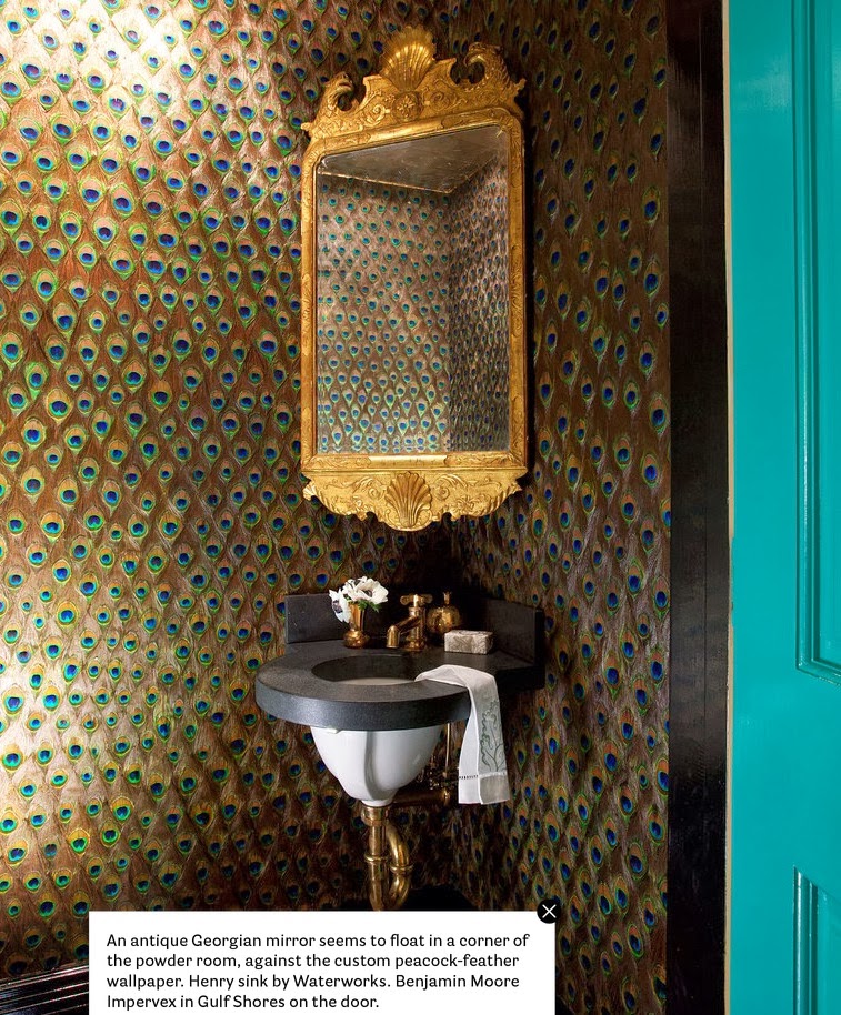
But my favorite wallpaper this issue was this custom
peacock feather wallpaper for the loo. So much fun.
The next feature is about injecting color into
a suburban Tudor house.
Do you feel like everyone is trying to emulate Kate Ridder
with her now iconic room?
This room has ceramic ribbons stuck on the wall.
What is going on people?
It's stuff like this that give suburbs a bad name.
Like the cornflower blue wallpaper.
Sometimes it's hard to add visual interest to a new build
albeit "Tudor" home so this hit the mark.
Well some decorator earned their painter stripes or
someone just used a lot of decorator's tape.
someone just used a lot of decorator's tape.
Calm and soothing bedrooms though.
House Beautiful also did a feature about how to make a
warm and homey atmosphere.
Have you noticed this odd trend the last decade where a lot of homeowners wants their houses to look like B & B's and boutique hotels pretend to look like it's your house after a reno?
Well this room and furniture arrangement just looks like
a lounge at a country inn.
This is the token House Beautiful lazy throw shot.
I really like this dining room - fresh and inviting all at once.
I wouldn't mind this in a B & B or a home.
Steven Gambrel is really making his mark with rich colorations
and built in bookshelves. I like his signature moves.
Grey with a punch of red brings some energy to the foyer.
Who doesn't love the classic Hick's hexagon wallpaper?
I like the similar hexagon motif in the carpet in the room below.
It adds a modern touch to the paneling.
Inspiring kitchen picked two types this month.
The first one was by the master Alex Vervoodt.
He can do no wrong in my eyes.
An open flame oven is on my kitchen wishlist.
The second kitchen had brass sheets enveloped on the
kitchen island.
They also emphasized cooling down the effects of some bright colors.
House Beautiful is starting to get a lot of guest editors in charge of a feature. This one was about beds.
Ruffin Costello is saying we shouldn't make our bed
because it is a little sexier.
"Sheets are unironed, duvet and blanket a bit rumpled, pillows tossed in an inprecise pile."
So basically the new American dream is to live like you are at a college dorm.
I hate that print of the vulture on top of the bed.
Not the art itself but it is ridiculously positioned.
But she did save himself with this bedroom.
Great textures, just enough pillows, nice throws.
Have a lovely weekend all x
PS This is a no comment post as I am moving this weekend. Again...

.PNG)
.PNG)
.PNG)
.PNG)
.PNG)
.PNG)
.PNG)
.PNG)
.PNG)
.PNG)
.PNG)

.PNG)

.PNG)
.PNG)
.PNG)
.PNG)
.PNG)
.PNG)
.PNG)


.PNG)


.PNG)

.PNG)
.PNG)


.PNG)
.PNG)


.PNG)
.PNG)
No comments:
New comments are not allowed.